Google reveals the top things people want to find out ‘How to’ do.
Google has a new website compiled using search data and built by its News Lab, working
together with Xaquin G.V., an interactive visual data journalist. The site uses data related to
searches made by users about “How To” do things, which represents a massive amount of
activity on Google, it turns out.
together with Xaquin G.V., an interactive visual data journalist. The site uses data related to
searches made by users about “How To” do things, which represents a massive amount of
activity on Google, it turns out.
Xaquin explains in the visual essay that he was inspired by his own searches, stemming from
a general lack of handiness around the house. I sympathize – I spend a lot of time on
Google trying to figure out how to do relatively basic things like fix a toilet pump or wire a
doorbell.
a general lack of handiness around the house. I sympathize – I spend a lot of time on
Google trying to figure out how to do relatively basic things like fix a toilet pump or wire a
doorbell.
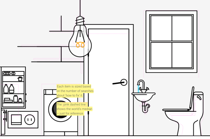
The new site designed by Xaquin working with Google and its Trends tools allows users to
enter whatever country they want into a field to see what the top “how to” searches are for
their region. The relative popularity of things around the house people search to fix are
represented by larger or smaller graphics in a household scene – in Canada, for instance,
it turns out doors are really commonly searched for, as well as fridges and toilets.
The essay also examines the top 100 ‘How To’ searches made worldwide to see what people
generally needed assistance with, and those results are very illuminating. Xaquin broke them
down into categories, with visual representations of how popular each is.
generally needed assistance with, and those results are very illuminating. Xaquin broke them
down into categories, with visual representations of how popular each is.
People want to know how to make pancakes, make money, lose weight and boil eggs. People
really, really want to know how to kiss, get pregnant, and tie a tie. And if you’re actually
curious about how to do those things, too, you can click through on any result graphic to be
taken to the actual Google results.
really, really want to know how to kiss, get pregnant, and tie a tie. And if you’re actually
curious about how to do those things, too, you can click through on any result graphic to be
taken to the actual Google results.
The site is responsively designed and looks great on mobile. Google News Lab Data Editor
Simon Rogers told me that a focus on mobile performance is a priority for its experiments in
visual storytelling, given how much of the audience accesses via mobile devices.
Simon Rogers told me that a focus on mobile performance is a priority for its experiments in
visual storytelling, given how much of the audience accesses via mobile devices.
Rogers also said that projects like this help Google explore what its data might be able to do
in terms of telling stories and fueling interesting developments in data journalism.
in terms of telling stories and fueling interesting developments in data journalism.
No comments:
Post a Comment